Website Redesign
UAP Member Portal
An improved website can serve as a showcase for the professionalism and vision of UAP, reinforcing its position as a leading organization in the architecture community.
ROLE
UX Designer
Interaction Designer
CLIENT
United Architects of the Philippines
PROJECT TYPE
Web Design
TIMEFRAME
1 week

Current State
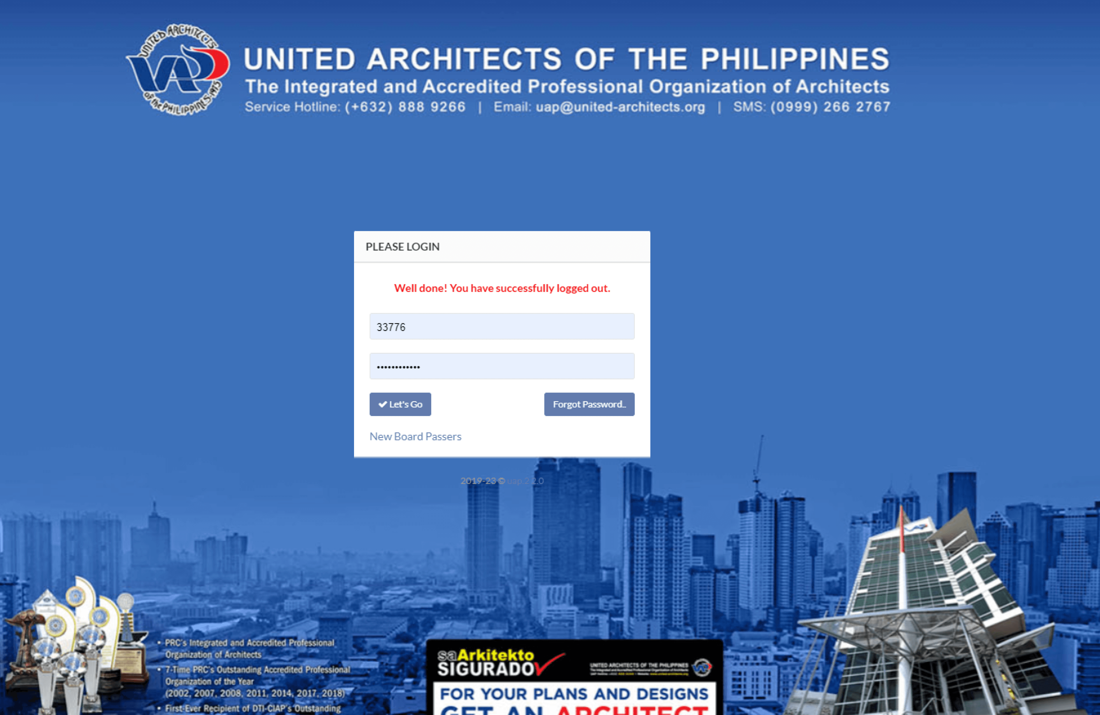
Inconsistent design elements that hindered visual harmony and brand identity are evident as you enter the homepage. To add to that, the absence of a dashboard landing page once you sign-in make it a hassle to access vital information, such as CPD points and organization fees. Overall the site has unnecessary clutter and hard to use.

Wireframes
I made some wireframe sketches for the dashboard landing page, figuring out how to create a simple interface where vital information can be easily accessed.

Mockup
I focused on revamping the homepage, giving it a heroic touch for the organization. Additionally, I made sure the login window was conventional and user-friendly.
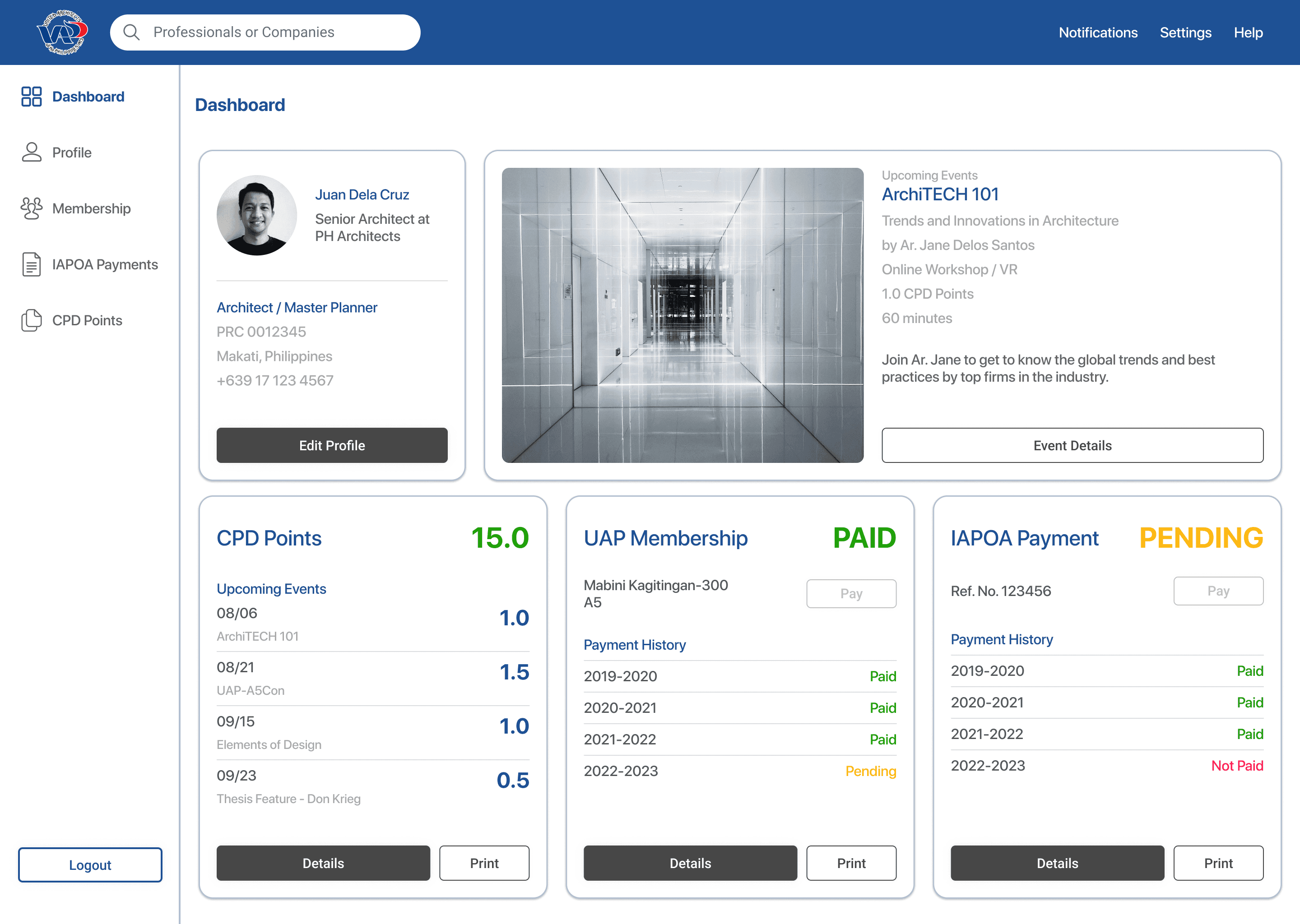
For the dashboard landing page, I kept things simple and clean, highlighting essential information that's crucial for registered architects.
I also designed the pages that deal with points and fees, improving the user experience for registered architects seeking CPD points and organization fees information. As a new addition, the event information feature offers better visibility for upcoming events that users would find interesting.
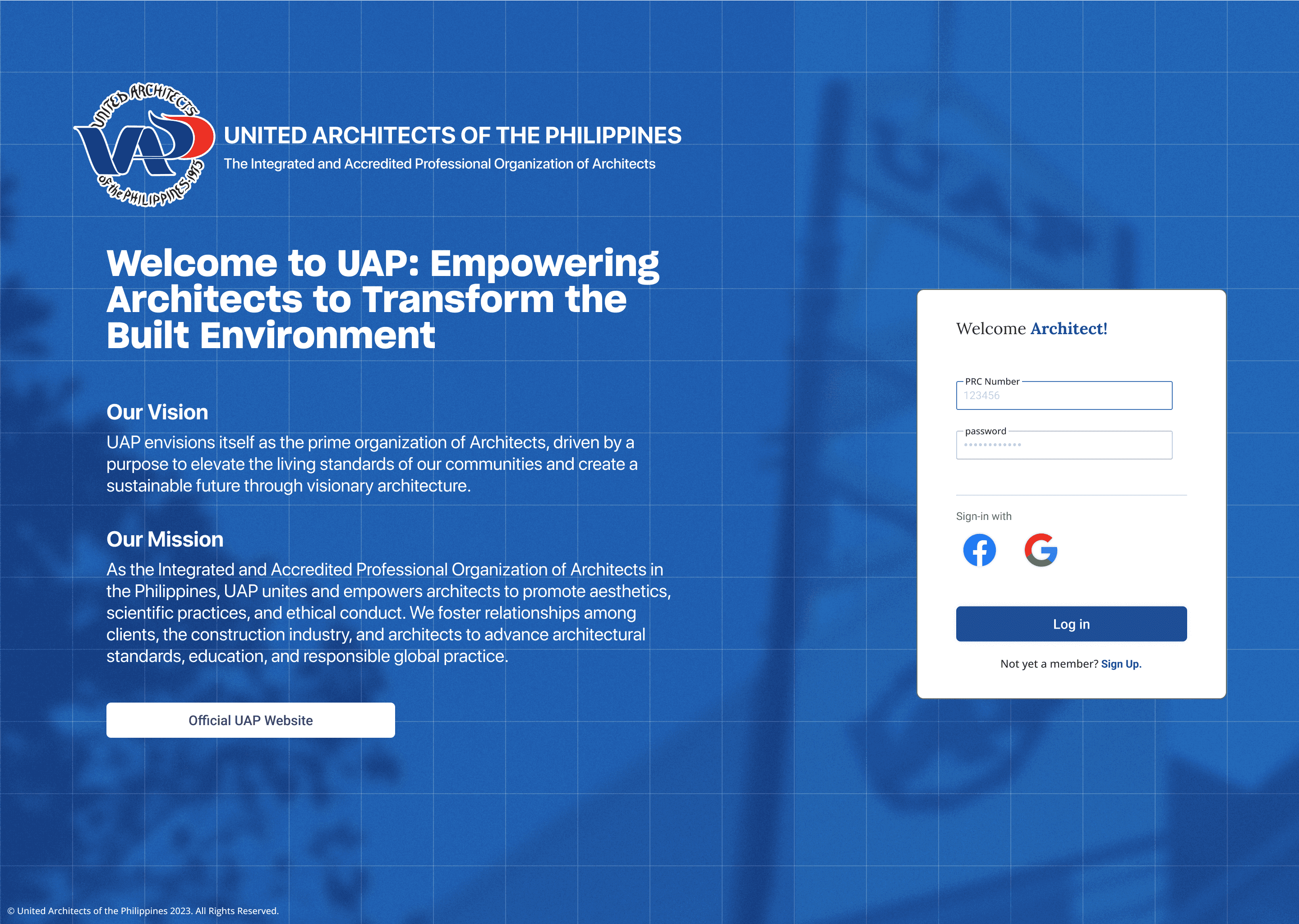
I focused on revamping the homepage, giving it a heroic touch for the organization. Additionally, I made sure the login window was conventional and user-friendly.
For the dashboard landing page, I kept things simple and clean, highlighting essential information that's crucial for registered architects.


As an architect, I thought of doing this study to help the professional community stay relevant in the digital age and make it easier for everyone to use the website.
Key Takeaways
Design Thinking
Card Layout
Visual Design
Back to Home
Unnecessary name for a button. It should be obvious and conventional.
No need for pleasantries here.
Graphics does not add value to the page.
Member log-in page is the Edit Profile page, no dashboard.